A make-over is always a good idea
Manfrey has just renewed the graphic design of its packaging, therefore keeping their constant-innovation, client-oriented policy.
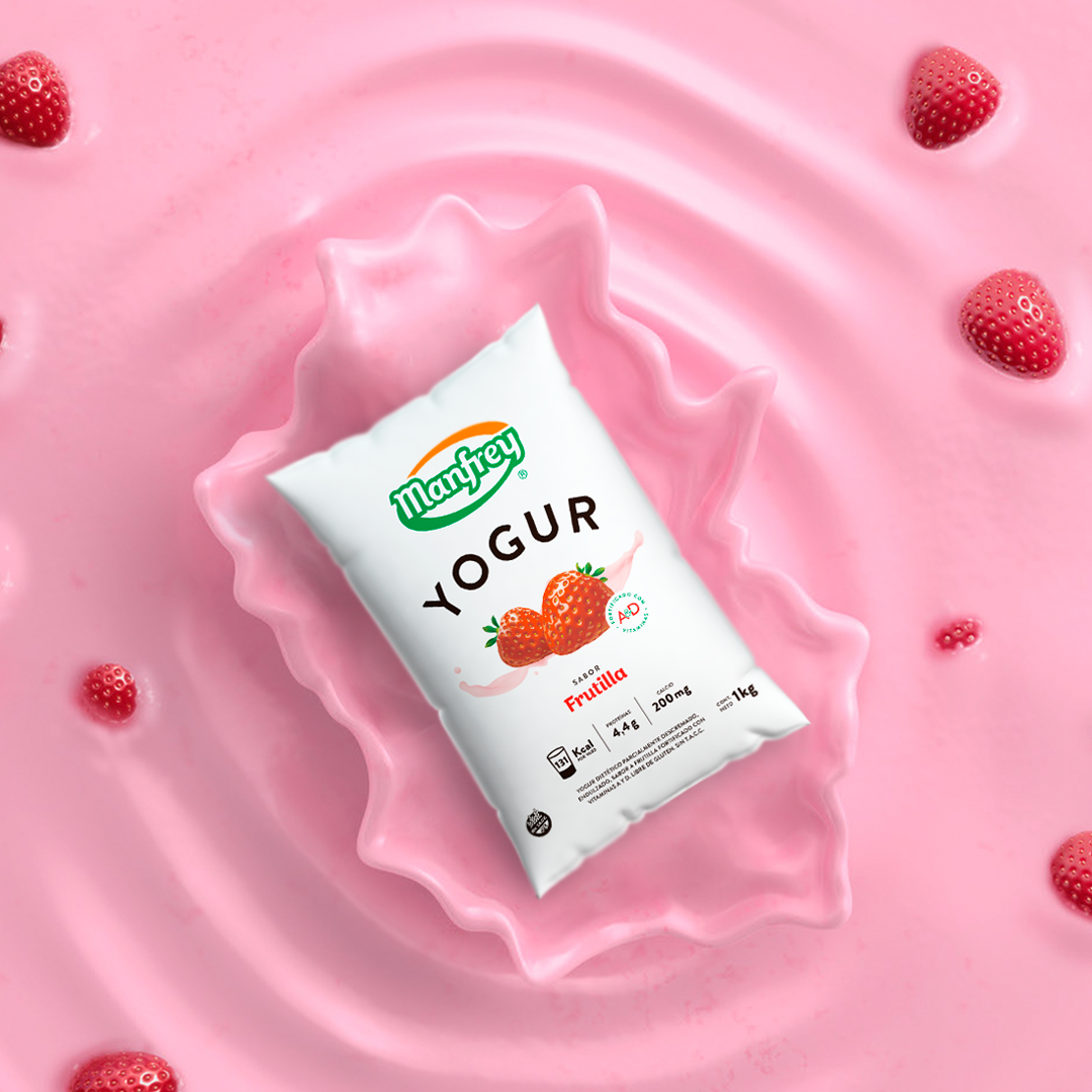
Aiming to represent the purity and quality of their products, Manfrey chose a clean design, with clear and easily-decoded information, high-impact images and vivid colors.
Their new image emphasizes the attractiveness of their products, displaying them as healthy, appetizing and pleasurable food.
This restyling project resulted from the need to renew their image in order to better fit with the current trends and to walk alongside the client and the constantly-changing market in order to improve brand positioning.
Besides packaging redesign, Manfrey has a new packaging for their UHT milk. In line with the current market, Manfrey has launched their TETRA BRIK Aseptic MID 1.000 ml bottle of milk with FlexiCap opening, that makes opening and closing the container easier and preserves the quality of the product in a perfect way. The company has also launched the app “Pack Story”, an augmented reality platform that uses products as their new communication medium. This image makeover can not only be seen on shelves but also on their strong social media presence, which is the main platform for promoting products and interacting with clients.